Leigh Barefoot Branding Project
“Sibyl,
I could not be more excited about the new brand logos you designed. Somehow you managed to draw out a vision I never knew existed and the finished designs far exceeded my expectations. Professional, personal, and just all around BAD ASS are the only ways to describe you, and your talent. I cannot wait to start showing them off.
Such an amazing project start to finish. Thank you, thank you, thank you!
Leigh”

Leigh Barefoot is an award-winning powerhouse realtor in the Hampton Roads area of Virginia. We live in the same town, and although I did not know her very well at time of our first meeting, I was very familiar with her reputation as a sought-after realtor with numerous accolades.
When Leigh hired me to rebrand her business, we spend quite a bit of time talking about what is most important to her when working with clients. What do they love most about her? What does she love most about helping them? What inspires her visually as we establish a new “look and feel” of her brand?
Within a short amount of time, I began to really understand the core values that drive Leigh each day when helping her clients.
She truly cares about her clients and supports them through the closing and beyond.
Leigh sees her business as a realtor as life-long friendship, not just a transaction, and continues to build relationships with her clients long after their deals are closed. She even hosts several client appreciation events as gratitude for those who send her referrals.
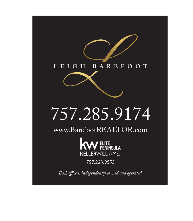
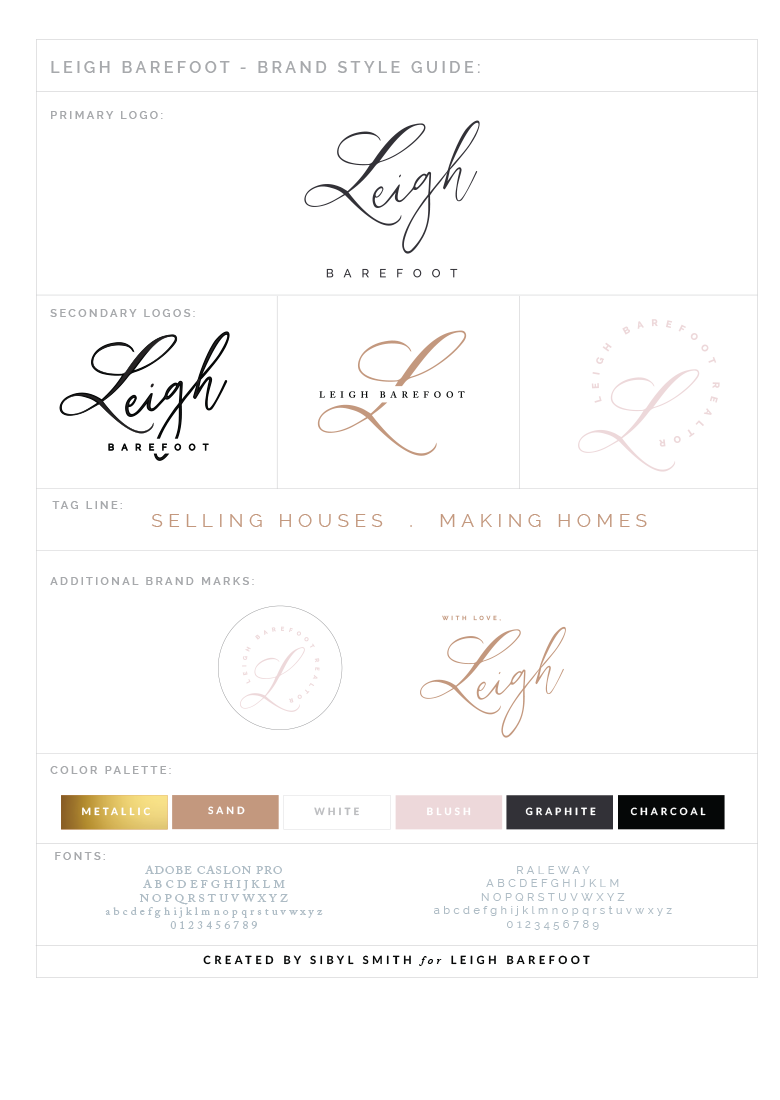
As we started the visual branding process, it was important to establish the “look and feel” as a first step. In her inspiration board, you can see sleek and bad ass with lots of black and white, but it still includes soft earth tones and even some pops of metallics. (The metallics have been key in collateral that you’ll see later in the project.) To date, I think that this is one of my favorite inspiration boards.

Silhouette | Things | Flower | Nails | Texture | Woman with hat
The new hand drawn logo aligned with her previous “L” that she really loved, but is updated with a few options that work well in different sizes and spaces. We also collaborated on her tagline: “Selling Houses . Making Homes”
The new color palette has the darks and lights that she loves, as well as some neutral earth tones and a metallic.
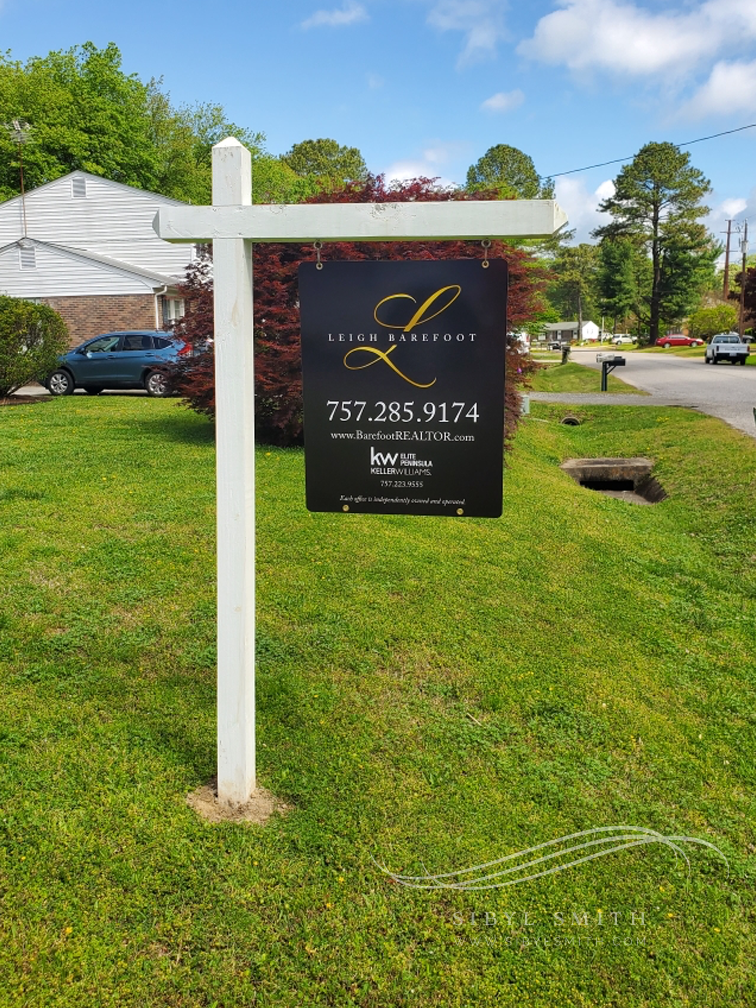
Once the logo designs were finalized, we were able to start applying them to all of the fun pieces – social media, printed collateral, signage, etc….
Social media banners, profile, letterhead + envelope and business cards: